More Info at Your Fingertips
MDCollections was designed as a mobile-first app, but larger screens should do more than scale up the phone layout. On iPad and other large screens, the split-view interface gives collections a denser, calmer browsing experience.
This feature matters most if you are using MDCollections as your day-to-day collection workspace, especially alongside Obsidian on the same device.
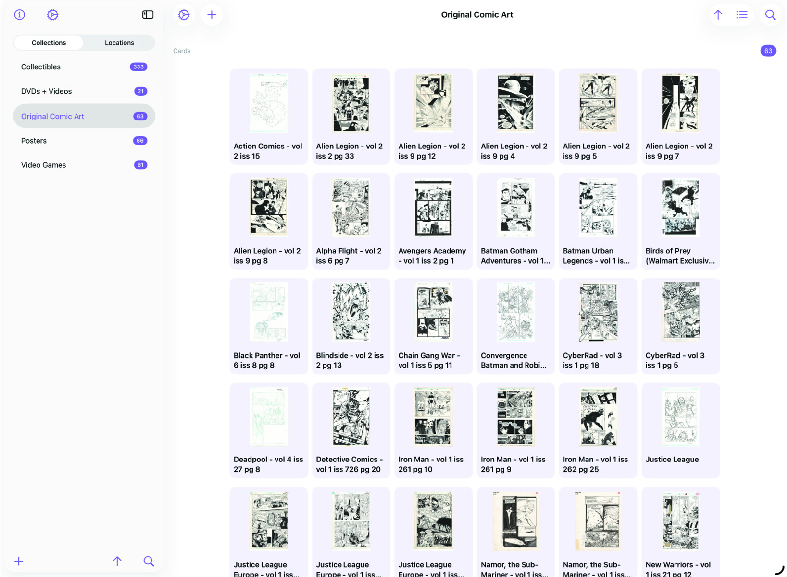
Split View Layout
On large screens, MDCollections can show the sidebar and the detail view at the same time. Select a collection or item on the left, and its details appear immediately on the right. That reduces context switching and makes browsing feel more deliberate.
Sidebar Top: About and Settings
The top of the sidebar keeps app-level controls easy to reach without interrupting the collection flow. That is especially useful on iPad, where the screen has room to keep more context visible all the time.
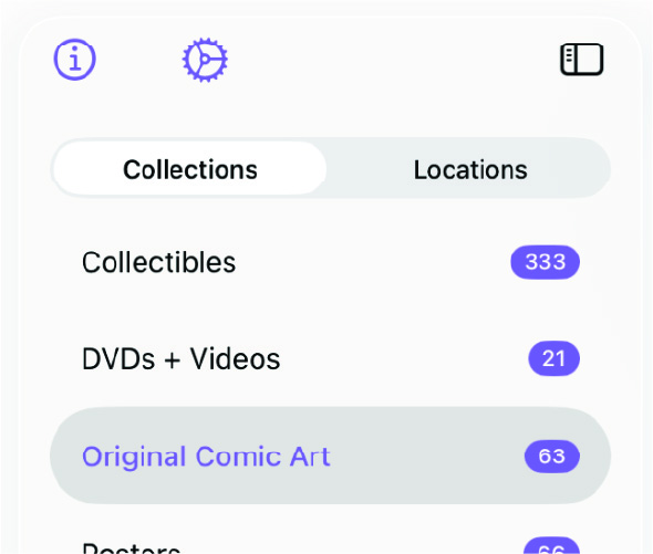
Sidebar Bottom: Add, Sort, and Search
The bottom of the sidebar is where the action buttons live:
- Add - Create a new collection or location, depending on which tab is currently selected in the sidebar.
- Sort - Change how the list is sorted without leaving the sidebar.
- Search - Filter the current list to find what you’re looking for quickly.
These controls stay pinned at the bottom of the sidebar, so they remain reachable regardless of how long the current list gets.

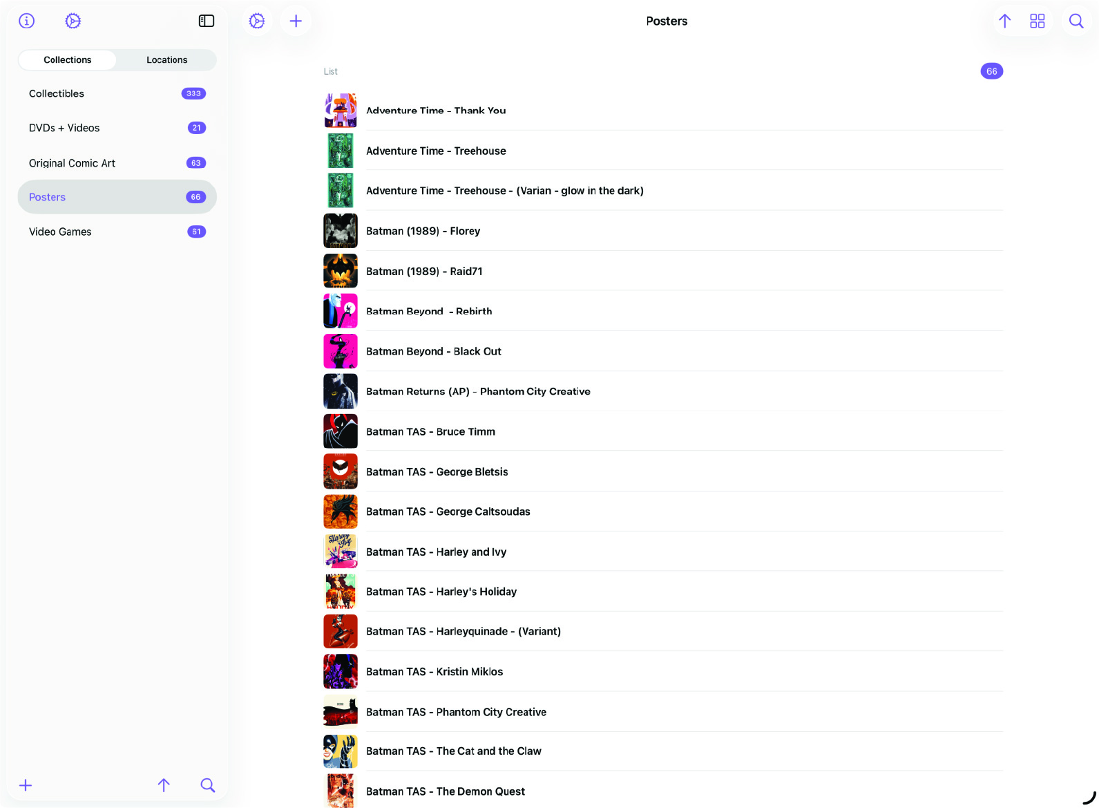
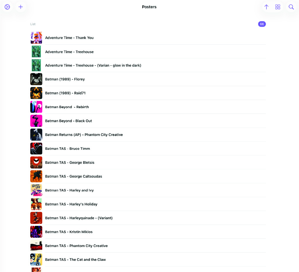
Detail View
The detail view stays visible alongside the sidebar, so you can browse lists and evaluate details at the same time instead of repeatedly drilling in and backing out.
More Info at Your Fingertips
The split-view layout is about making a large screen actually useful. On a phone, one-screen-at-a-time navigation makes sense. On an iPad, seeing the sidebar and detail view together makes collection management much faster.
If you use MDCollections heavily on iPad, this is one of the clearest quality-of-life improvements in the app.